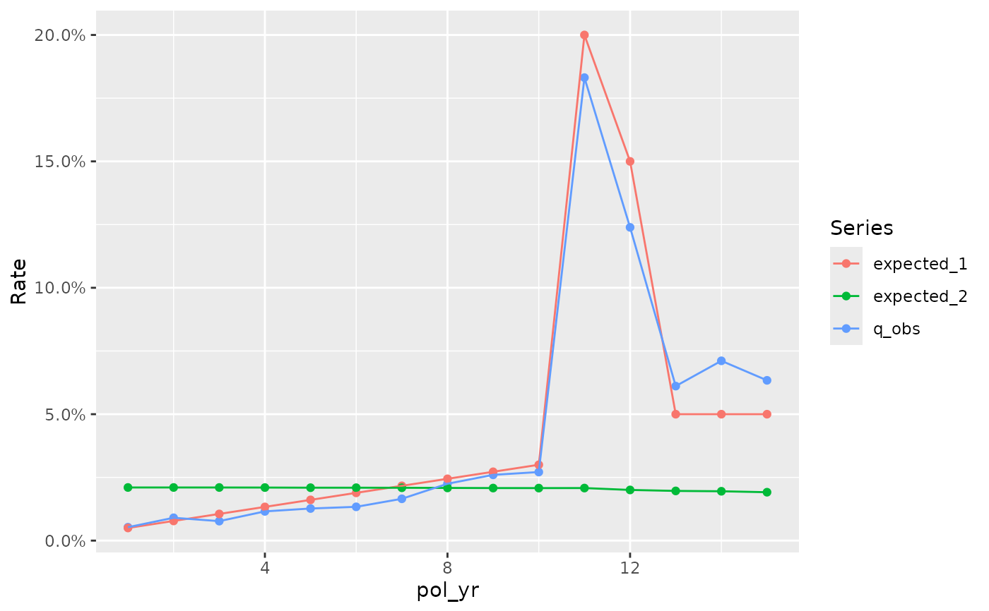
These functions create additional experience study plots that are not
available or difficult to produce using the autoplot.exp_df() function.
Usage
plot_termination_rates(object, ..., include_cred_adj = FALSE)

plot_actual_to_expected(object, ..., add_hline = TRUE)
Arguments
- object
An object of class
exp_dfcreated by the functionexp_stats().- ...
Additional arguments passed to
autoplot.exp_df().- include_cred_adj
If
TRUE, credibility-weighted termination rates will be plotted as well.- add_hline
If
TRUE, a blue dashed horizontal line will be drawn at 100%.
Details
plot_termination_rates() - Create a plot of observed termination rates
and any expected termination rates attached to an exp_df object.
plot_actual_to_expected() - Create a plot of actual-to-expected termination
rates attached to an exp_df object.
Examples
study_py <- expose_py(census_dat, "2019-12-31", target_status = "Surrender")
expected_table <- c(seq(0.005, 0.03, length.out = 10), 0.2, 0.15, rep(0.05, 3))

study_py <- study_py |>
  mutate(expected_1 = expected_table[pol_yr],
         expected_2 = ifelse(inc_guar, 0.015, 0.03))

exp_res <- study_py |> group_by(pol_yr) |>
  exp_stats(expected = c("expected_1", "expected_2"))

plot_termination_rates(exp_res)


plot_actual_to_expected(exp_res)

